For promotional discs, the norm adopted was a simple lozenge/square-shaped box with basic text. Arab Strap’s third single, “The Clearing” (1997), was an outlier in that they chose to use the ‘lozenge’ as the official cover image, but also to embellish it. They included a sketch of a treeline drawn by Morag Campbell — the friend encountered on “The Girls Of Summer” EP. This was directly aligned to the Erich Krüger painting of an autumnal wilderness included inside.
Included with early releases was a ‘for more information’ postcard fans could send in to get on a mailing list. Being Arab Strap, of course, it had a twist, but one very much in line with their aesthetic. It featured a sketch that looked like it might be from a sex manual or redrawn from a private photo or porn film — again, that liking for slippery meanings.
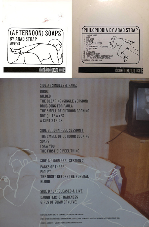
The interest in public information style imagery continued on further releases. First, the “(Afternoon) Soaps” and Philophobia promos included the same drawing of a male figure lying seemingly unconscious. In each case it was reversed so he’s lying left-to-right in one and right-to-left in the other. It looks like a first aid image. Moving forward to 2010’s Scenes Of A Sexual Nature boxset, there’s an unused piece originally intended for “(Afternoon) Soaps” with the prone figure overlaid on a bed, with the twist making it look like a crime scene chalk outline.
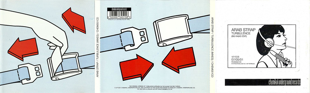
The “Turbulence” single of 2001 would take this vibe in two directions. First, there are two very literal pictures of how to do up a seatbelt, likely from an airline safety card. Second, the promo took what looks like a call centre picture and tweaked it so the woman grips a vibrator. Like “The Clearing”, it’s simultaneously part of the thread going all the way back to 1996, but also an outlier in being hyper-literal in its connection to the song title concerned.
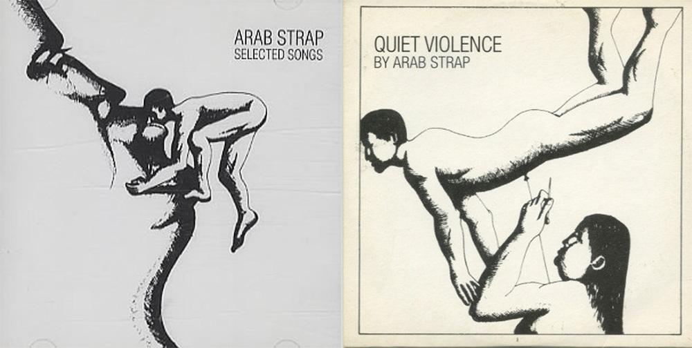
The pen-sketch type imagery was used again on the Quiet Violence compilation of 2002 (a limited edition distributed free at live shows) and on the Selected Songs promotional compilation issued in the U.S. In the former, a man is shown falling or suspended above a woman who is about to prod a rather large nail or pin into his nether regions. In the latter, a tiny man is surmounting a female face of mountainous scale to receive a kiss.
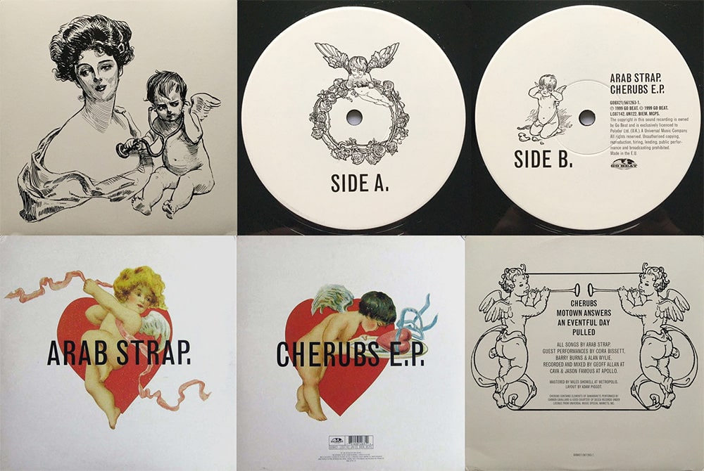
Between 1999-2001, there’s a brief flirtation with other aesthetic styles. First, the “Cherubs” EP (1999) is adorned with quite an elaborate series of images of cherubs inspecting hearts, blowing fanfares, crying over a broken heart, ribbon dancing, carrying a rose wreath, and taking a stethoscope to a woman’s heart in a neat mix of the romantic and the medicinal.
Go! Beat also sublicensed Mad For Sadness to Jetset Records in the U.S. For the album promo (2000), the label seems to have created their own art, going with a World War Two Hurricane aircraft and a red-white-blue aesthetic. This is the only release of Arab Strap’s entire career that gives every indication of having been created without any involvement from the band at all.
Next came the limited edition “To All A Good Night” (2000) Christmas single with a basic scene of snowed in buildings in a winter landscape, as well as “Rocket, Take Your Turn” (2000) which was part of Chemikal Underground’s Fukd series all of which came in one sleeve style.
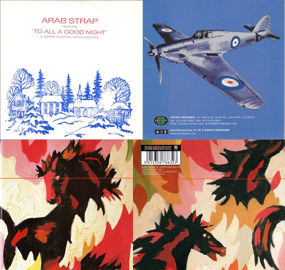
Finally, crowning this phase of dead-ends, was new album The Red Thread (2001). Adorned with striking drawings of red/black horses against shaded backdrops, as well as a series of little devil images in the inlay, it still stands entirely outside of Arab Strap’s established visual identity…Except in the enduring lean toward the personal: the devils were drawn by Gavin Moffat, the cover art by the mysterious M.P. Moffat.
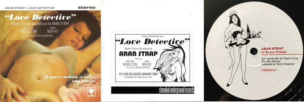
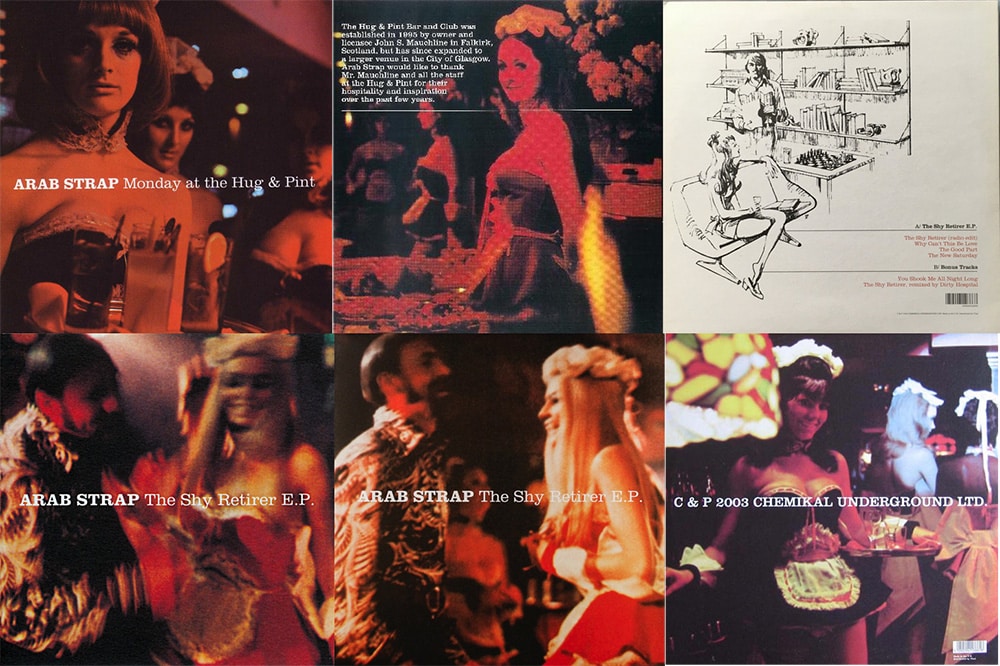
In the background, however, the 2001 single “Love Detective” became the visual bridge between past and future. While early photography cast the band’s friends as stars of an indie film all their own (aka ‘life’), “Love Detective” wrapped itself in the conceit that it was promotional material for a ’60s-era sexploitation movie. A softcore front cover moved on from Philophobia/Live imagery, with a judicious straight cut below the waist rather than losing a head or other appendages.
Dwelling on the commercialisation of female sensuality was the direction Arab Strap chose to mine further in the 2000s. For the promo of “Love Detective”, the band included a line drawing of a woman in apparent ecstasy, mocked up as an advertisement for the film. This was both a nod to and a twist on their liking for functional images.