Sometimes I think I’m reading Michael DeForge the wrong way. His Instagram strip, Leaving Richard’s Valley, is coming out as a book collection from Drawn & Quarterly soon, but I’m catching up on Brat, released last fall from Koyama Press. It’s a story of an aging celebrity, a former juvenile delinquent renowned for acts of vandalism as art installations. She’s still appreciated by her now middle-aged followers. But I’m not sure “story” is the best word to describe these graphic narratives. Or rather, Brat is one perfectly accurate description that might accidentally obscure what’s most interesting about DeForge’s art.
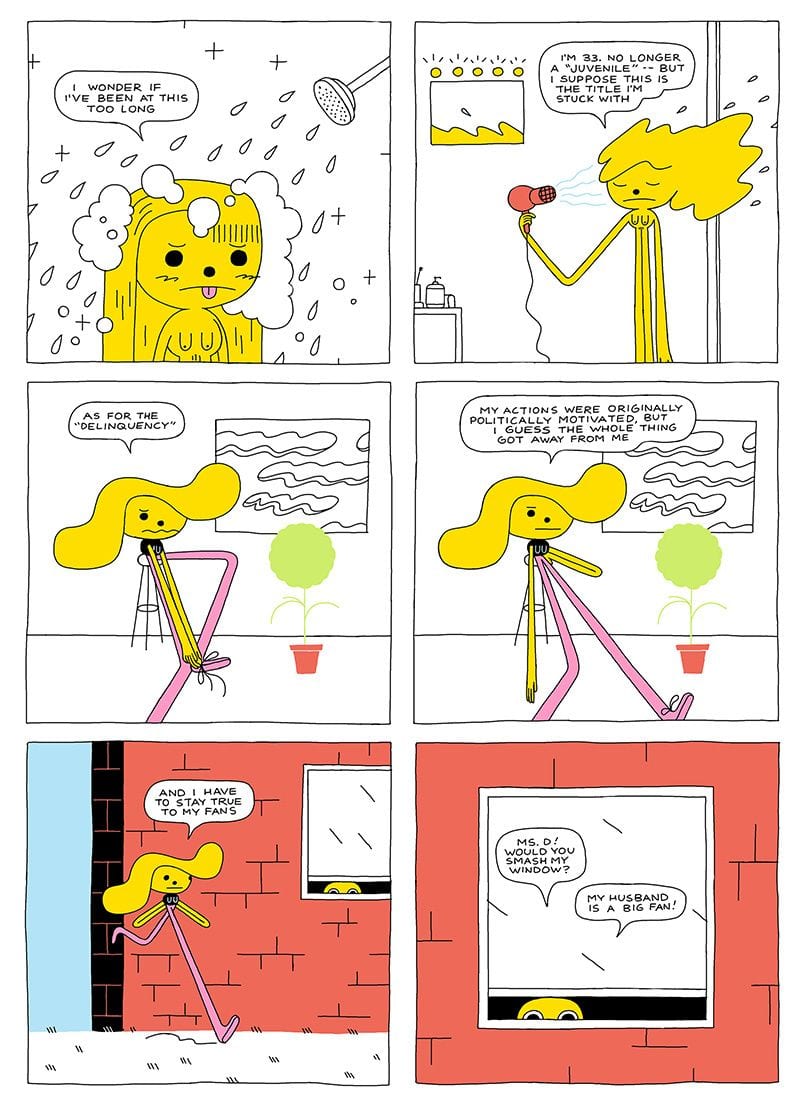
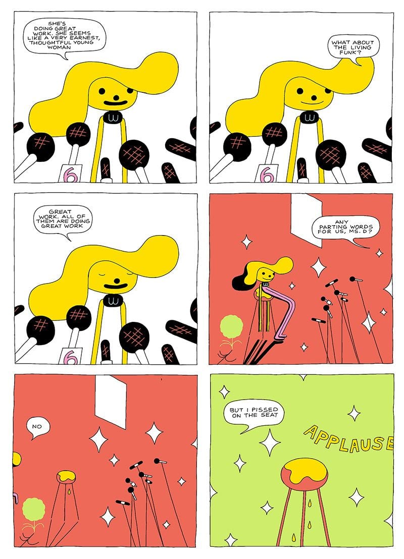
At one level, Brat is simply a cartoon—albeit an extreme one. While all cartoonists simplify and distort natural proportions, few stray quite so far from recognizable anatomy. Charles Schultz’s Peanuts characters have impossibly large and round heads, an effect further exaggerated in Trey Parker and Matt Stone’s South Park cast. In DeForge’s book, the character Brat’s head is large and round too—at least five times larger than the tiny circle of her torso, with pipe-cleaner-like limbs extending almost tenfold. If any other male artist drew his female protagonist in a nude shower scene on the second page of a comic, I would worry, but there’s not even the most remote element of eroticism here. While still somehow registering as “human”, the level of abstraction breaks even the most expansive norms of cartooning.
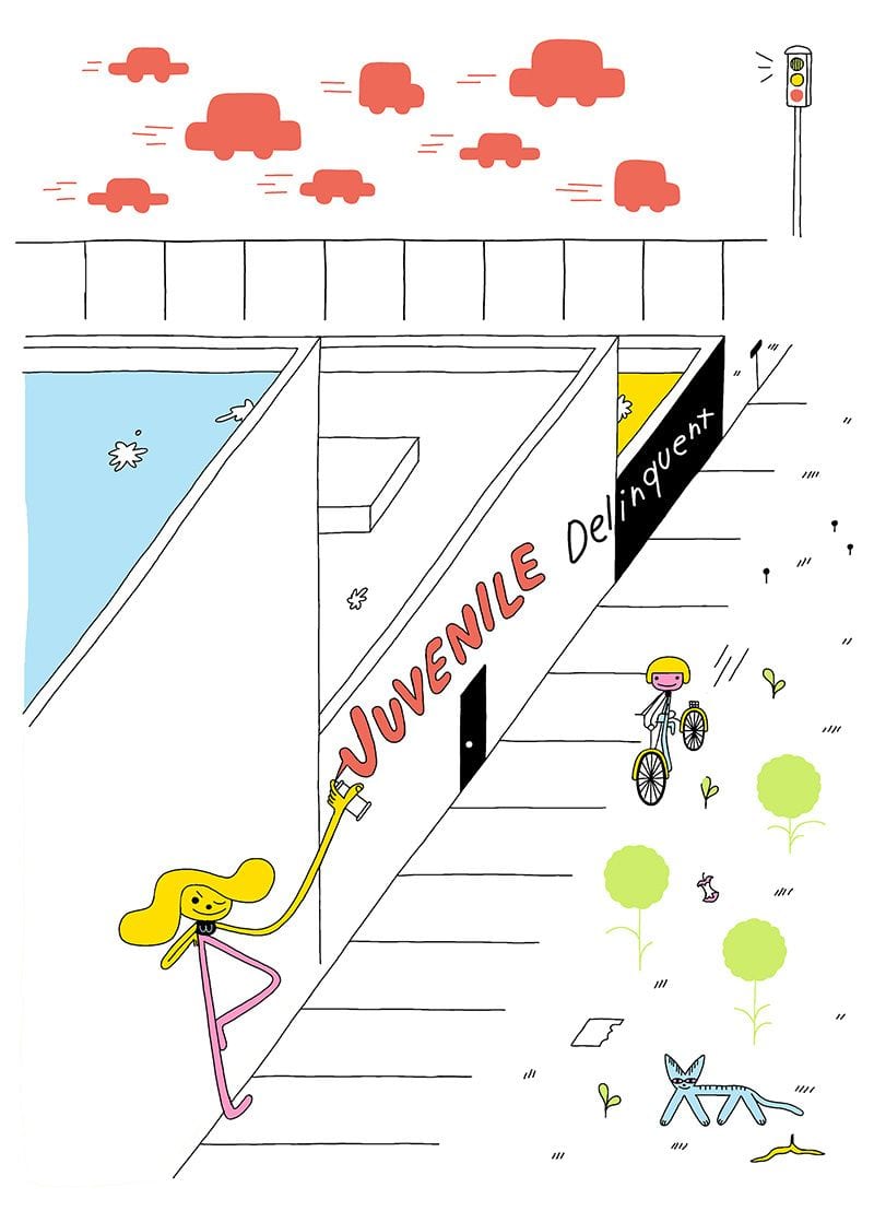
That abstraction applies to the rest of the story world, as well. While DeForge is capable of drawing geometric depth, complete with multiple planes and vanishing points, he prefers flat surfaces that evoke while also rejecting the illusion of three-dimensional space. Sometimes he combines the approaches for discordant effects. As Brat spray-paints the cascading walls of a building complex, the street beyond features solid red vehicles above a grid of sidewalks squares. Not only is the 90 degree angle entirely flattened, the cars look like stenciled cut-outs reduced to their absolute minimal shapes. Any further reduction and they would cease to represent anything at all.
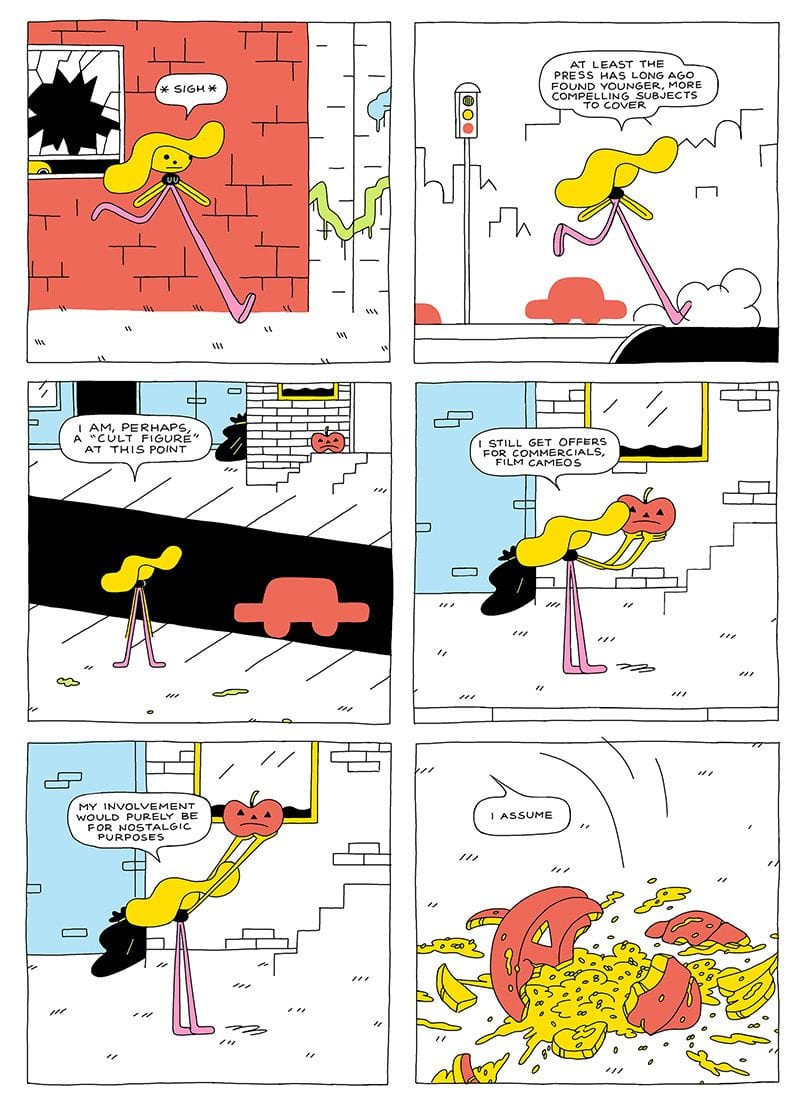
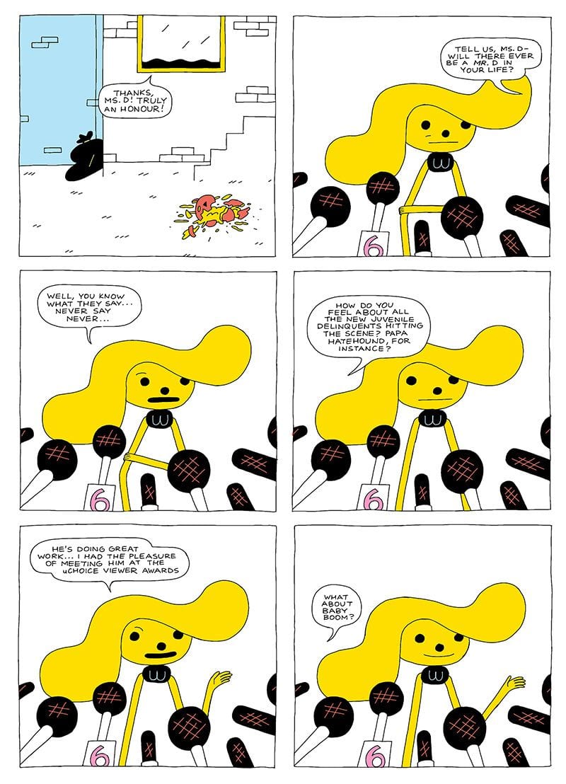
While dimension-deforming environments are another norm of cartoon worlds, few wander this far to the edge of pure abstraction—let alone cross it. When I say I’m reading Brat the wrong way, it’s because I’m spending too much time actually reading. DeForge’s layouts are traditional grids, most often 3×2 with a range of full-page and other variants to give the reading paths some visual rhythm. Most panels also feature a cluster of words, usually in talk balloons as characters converse or Brat’s monologues break the fourth wall. Both acts—following a sequence of images and decoding written words—are considered “reading” when it comes to comics, often with an emphasis on the literal, word-focused sense. That’s also usually where “story” happens. And DeForge supplies plenty of that — Brat torches a police car, Brat reads her fan mail, Brat shits on the floor—but there are other kinds of stories on these pages too.
As I wander deeper into the story-world narrative about the narcissistic crises of a still-profitable has-been depressed by her nostalgia-driven fanbase, I find myself more interested in the surface qualities of the images themselves—how the identical black dots of Brat’s eyes and nose shift within the panel frames, or how an x-shape of a cat wraps itself around the column of Brat’s nominal leg, or how two figures move through a landscape of … are those black those clusters supposed to be stars or tumbleweeds or just random shapes? When the young Brat narrates in a flashback, her body’s tiny shapes occupy only a fraction of panels that alter color with each iteration. The colored squares don’t represent the actual colors of walls or anything else in the story world. They’re just squares of color arranged on the surface of the pages. Even their sequence breaks down, since there’s no narrative logic to which color appears when in the story and so where on the page. The effect is closer to one of Andy Warhol’s Marilyn Monroe grids than to visual storytelling. It’s just abstraction.
And what would happen if there weren’t any words? The back of Brat’s head — two yellow swaths above a black semicircle — is visually undecodable out of context. Many of these panels would lose all representational meaning. DeForge is, of course, fully aware and manipulating these effects, and some of the book’s strongest episodic sequences take full advantage of them. “Tantrum”, for example, begins with Brat crying and swearing as her body warps into even more impossible proportions, deeper distortions of her already cartoonish distortions. In “Hi Mom”, the figure of Brat’s crying father bends and merges with her mother until the two are a single yellow pyramid. “Immodest” features Brat’s drunken form devolving into squiggly shapes and then retracting into single lines before shrinking into literally nothing. While the images nominally represent events in the story world—she’s depressed, she’s drunk—the “story” is about the shifting relationships of shapes on the page.
There’s plenty more of the conventional kind of stories too — a fling with an interviewer, the corruption of an intern, a kidnapping, various emotional meltdowns — but while each is entertaining, the bigger conceptual picture and its baseline pseudo-reality of extreme abstraction is the graphic novel’s main strength. Because comics are traditionally understood as literature rather than art, and so are “read” rather than viewed, it’s possible to appreciate Brat as just a fun riff on a comically and nihilistically self-involved performance artist-criminal twirling through a sequence of chaotic plotlines. But that requires looking not at but through the images, attending less to their actual qualities, and understanding them primarily as symbols and so almost as words that represent events in some other far-off place, and not as arrangements of ink on the physical pages in your hands.
While DeForge offers both kinds of stories, Brat is at its playful best when viewed rather than merely read.


