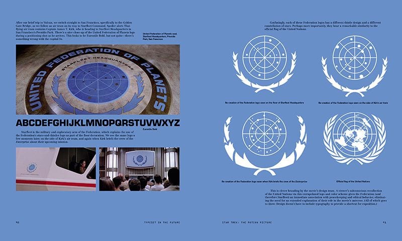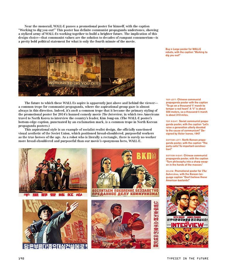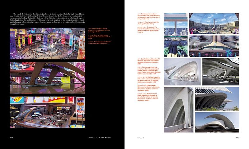
If you’re the kind of person who opens up a Word document and immediately notices the difference in line spacing between two paragraphs, the shift in font sizes or type, or the slight font color difference of a phrase that was copy-pasted from another document, then you probably suffer from typographilia. You could get that checked out, or you could indulge in some exposure therapy and read through Dave Addey’s Typeset in the Future, an art-book style volume that looks at typography and graphic design elements in popular science-fiction films, largely those that the audiences of the ’70s and ’80s are familiar with, and a few more recent blockbuster hits such as James Cameron’s Avatar (2009) and indie standouts such as Duncan Jones’ Moon(2009).
I first discovered Addey’s writing two years ago while preparing for a project on Ridley Scott’s 1979 horror/sci-fi film Alien, a personal favorite. A colleague shared Addey’s hilarious, insightful study of typography in Alien—and I was hooked, as well as pleasantly surprised to discover that Addey had written on more than just Alien, but by that time had already covered what are likely the two other most iconic “classic” (i.e., non-Star Wars and non-Star Trek) sci-fi films: Stanley Kubrick’s 2001: A Space Odyssey (1968) and Ridley Scott’s Blade Runner (1982). Addey’s blog, also called Typeset in the Future (or TITF for regular readers) began in 2014 and he published a few essays through to 2016, when the blog went silent. Given the present volume, it would seem the software develop and typography enthusiast was writing a book. In 2018 he released a new essay on his blog on Andrew Stanton’s WALL-E (2008) though the timing—three days before the book’s 11 December release—seems to have been set to generate hype for its print counterpart.
As with his short-lived blog project, Addey’s Typset in the Future is specific, pedantic, and goes into what most readers might consider absurd detail; for example laboring over whether the symbol in the robot WALL-E’s name is a hyphen, bullet, or interpunct in its given font (Gunship). Hint: it’s an interpunct, so I really should be writing “WALL·E”. To get into the nitty-gritty of sci-fi typograph, he looks at zoomed-in stills, production photographs, and reads the production, crew, and design histories of the films, all the while offering a hilariously apt look at the ways in which visual storytelling unfolds through design and font in sci-fi film. Moreover, his book gives historical background into the development of fonts generally, of specific fonts utilized in film, and of the trends in how sci-fi film design has deployed different font families to create the diegesis of the future.
Addey’s project is governed by the idea that type and design are an important element to how the sense of futurity in sci-fi films is visually curated. He’s not wrong, of course, and this is an underappreciated aspect of media, film, and TV studies generally: that design, and especially typography, shape viewer interpretation, and are certainly connected to ideological, generic, and temporal visual discourses. However, despite his rather broad claims about typographic design and sci-fi film, namely that the form is integral to the latter’s expression of (a sense of) futurity, the texts Addey surveys are incredibly limited. In fact, he’s only added three major film studies to this book on top of what he presented between 2014-2016 on his blog: Star Trek: The Motion Picture (Robert Wise, 1979), Total Recall (Paul Verhoeven, 1990), and WALL-E.
What’s more, Addey makes no justification for exploring only film, as opposed to or in addition to television, video games, novel and magazine cover art, and other visual sci-fi media. The film studies make up the bulk of the book, and are heavy with illustrations, and film and production stills. In addition, Addey includes a number of inserts (e.g., on the design of interfaces or on the history of ships called “Enterprise”) and interviews with typographic experts (like Stephen Coles), production designers (like Mike Okuda), and even directors (like Paul Verhoeven).
Indeed, Addey makes smart comparisons across films and media, and draws on real-world influences on sci-fi film design, so the book has a practical use to general interest readers who want to learn more about how the films surveyed in the book came to imagine their own particular visions of the future. In all, Addey’s Typeset in the Future offers a sleek, beautifully illustrated book that will entertain, probably teach everyone something, and look nice on coffee tables.


